❏ What is Lychee Resource Management?
Lychee Resource Management allows you to view workload, working rate, and productivity as graphs and tables in real time. You can select up to 3 summary columns for workload, allowing you to collect and analyze data flexibly from many perspectives. Finally, this plugin allows you to instantly see trends using graphic displays, resulting in quick and easy analysis.
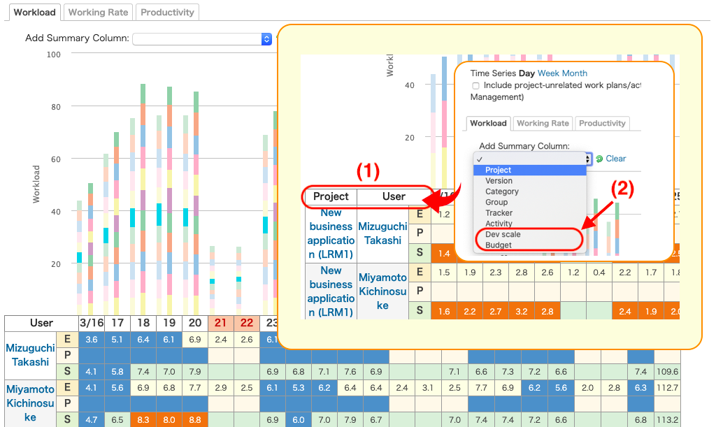
(1): You can specify up to 3 levels of summary items.
(2): Custom fields can also be specified for summary items.
❏ Resource Management Settings
Setting Number of Displayed Users
From the Administration > Plugins > Lychee Resource Management > Configure, you can change the “Maximum allowed display rows before alert” and “Maximum allowed display rows for chart highlight” settings.
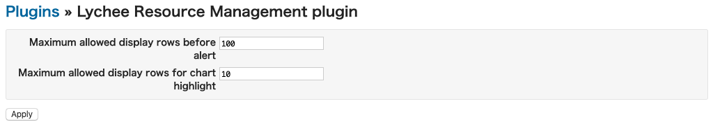
a) Maximum allowed display rows before alert
After setting this value, when you attempt to display a graph on the Resource Management screen where [Number of Users] > [Set Value], a alert message will appear asking whether or not you want to display the graph.
b) Maximum allowed display rows for chart highlight
After setting this value, when you attempt to display a graph on the Resource Management screen where [Number of Users] > [Set Value], you will not be able to use highlight display for the graph.
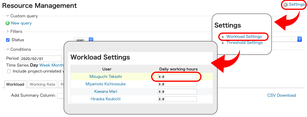
Setting User Assigned Working Hours
Clicking “Settings” at the top right of the Resource Management screen and then “Workload Settings” will take you to a screen for setting assigned working hours for users.
The working hours set on this screen will be used as the threshold for setting the background colors of estimated and spent times cells on the Resource Management > Workload tab.
*The value is set as 8 hours by default.
Setting Background Color Threshold
Clicking “Settings” at the top right of the Resource Management screen and then “Threshold Settings” will take you to a screen for setting background color thresholds.
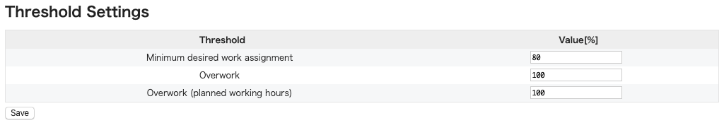
The settings for background colors are as follows.
- If the summary column is users only
| Condition | Color |
|---|---|
| [Estimated times] < [Working hours] x [Minimum desired work assignment] | Blue |
| [Estimated times] > [Working hours] x [Overwork] | Red |
- If the summary column is not users only
| Condition | Color |
|---|---|
| [Spent times] < [Estimated times] x [Estimated times Lower Threshold] | Blue |
| [Spent times] > [Estimated times] x [Estimated times Upper Threshold] | Red |
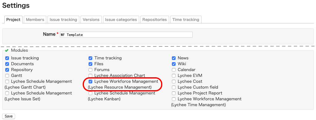
❏ Project Settings
You can select which projects will use Resource Management by going to each project’s Settings > Project tab > Modules and checking/unchecking the “Lychee Workforce Management (Resource Management)” box.
Projects which have the box checked will be included in the Workload aggregation.
❏ Resource Management Functions
Tabs are separated into Workload, Working rate, and Productivity, allowing you to perform multifaceted aggregation and analysis using graphs and tables for each.
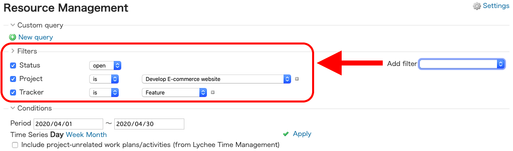
Extraction Conditions
You can select the following as extraction conditions for the data displayed on each tab.
- Filters
- Period
- Time Series
a) Filters
You can flexibly filter the data using the same filtering function as on the Issue List screen.
Note
This function can be used to filter only list-type custom fields.
b) Period
You can display estimated and spent times within the specified period.
If no period is specified, data will be displayed using the periods below.
| Time Series | Period Start | End of Period |
|---|---|---|
| Day | Today – 15 days | Today + 14 days |
| Week | First week of (This month – 1 month) | Last week of (This month + 1 month) |
| Month | This month – 6 months | This month + 6 months |
c) Time Series
You can specify which unit of time you want to use when displaying graphs and tables.
The links displayed under “Time Series” and the units linked to them are as follows.
| Time Series | Unit |
|---|---|
| Day | Displayed in units of 1 day |
| Week | Displayed in units of 1 week |
| Month | Displayed in units of 1 month |
d) Project-unrelated Activity Hours
Project-unrelated activities logged in Time Management can be included in spent times.
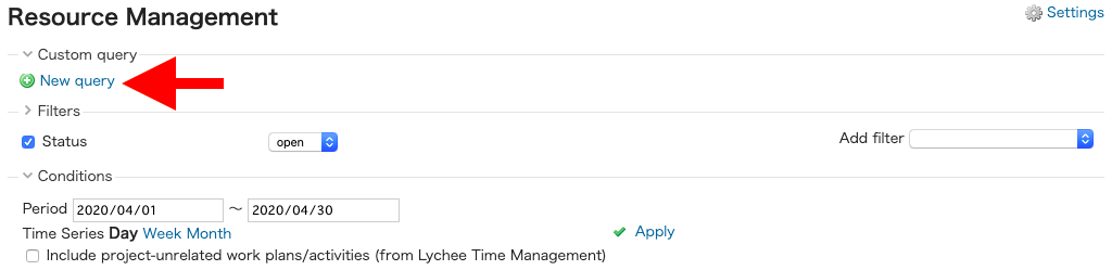
Custom Queries
You can save a custom query using the extraction conditions on each data display tab and “Summary Columns” on the “Workload” tab.
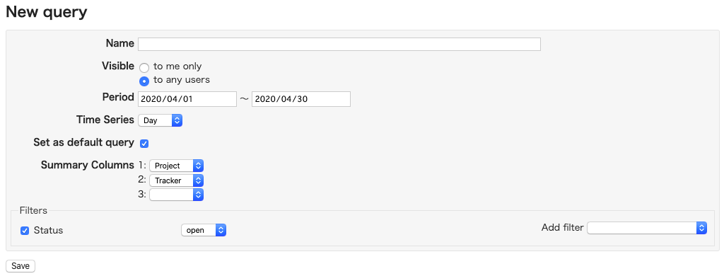
To create a custom query, click “New query”.
Enter the necessary information on the Add/Edit Query screen and click “Save”.
You can set a custom query to be applied to the initial display by checking the “Set as default query” box. You can only set “Set as default query” if you have also selected the “to any users” option.
Workload per Time Series
Clicking the spreadsheet headings (Day/Week/Month) in Resource Management allows you to view the detailed estimated and spent times per user for the time series unit you clicked.
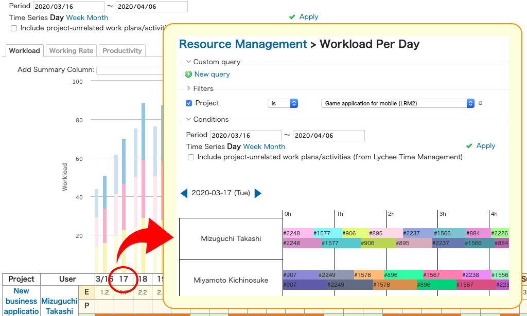
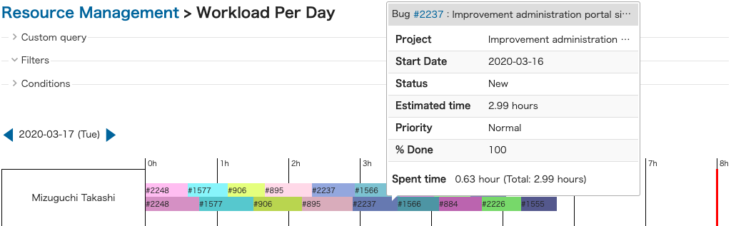
Also, clicking on an issue will display a pop-up with the issue’s details.
CSV Download
Clicking on “CSV Download” in the middle right of the screen will output the values specified by your extraction conditions in CSV format.
The output values are as below.
Additionally, the values will be outputted if the Summary Column on the “Workload” tab is only “Users”.
| Displayed Tab | Output Values |
|---|---|
| Workload | Date, User, Estimated times, Spent times |
| Working Rate | Date, User, Working rate |
| Productivity | Date, User, Productivity |
❏ Workload
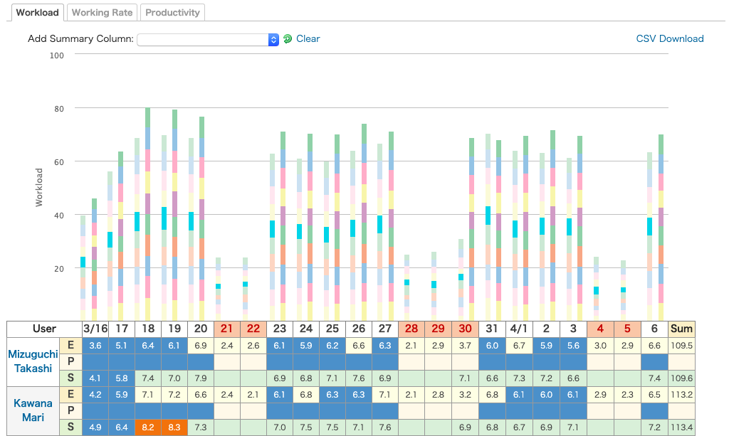
| Element | Description |
|---|---|
| Table | Estimated and spent times are displayed for each Summary Column. The estimated time displayed is the aggregated value of “Estimated time” entered for issues proportionately distributed across the issue’s period (except non-working days). The total values for the target period are displayed at the right side of each row. Clicking on the summary column in a row’s header will show you a list of that item’s issues. |
| Graph | The left-hand bars on the graph show the total of summary columns’ estimated times. The right-hand bars on the graph show the total of summary columns’ spent times. |
| Highlight | Clicking on part of a specific summary column on the graph will cause that summary column to be highlighted on the graph. |
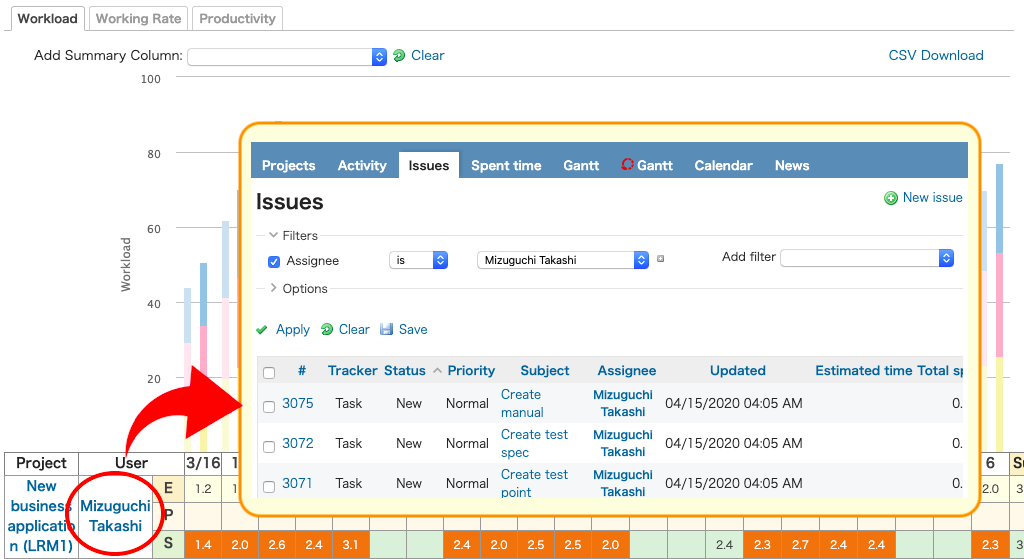
Displaying a List of Issues for the Summary Column
Clicking on an aggregated item’s row in the Resource Management spreadsheet will display a list of issues for that item.
❏ Working Rate
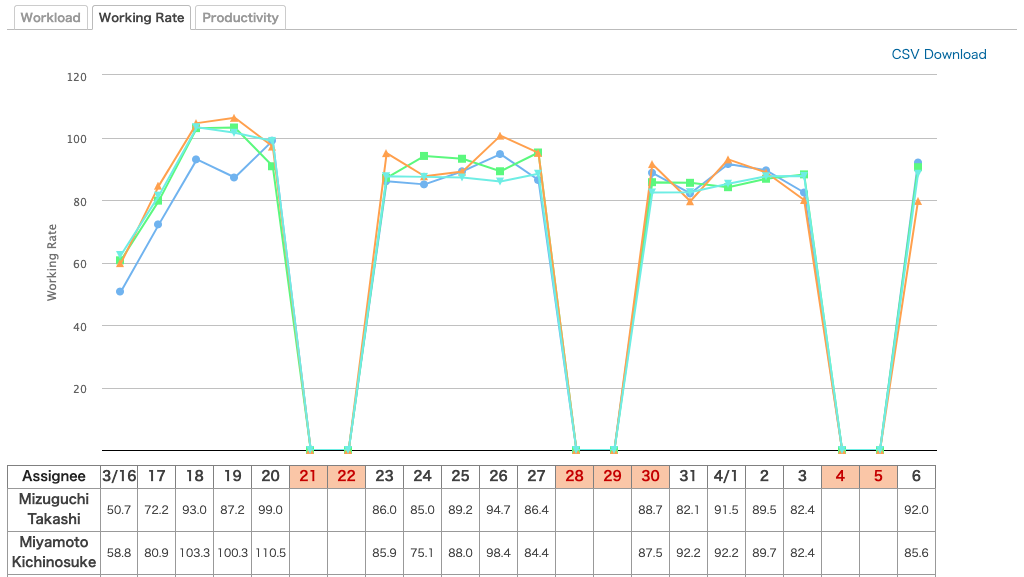
Table
Displays the working rate for each user.
Daily working rates are calculated using the following formula.
- Past dates including today
Working Rate = Sum of total spent times for that day / Working hours x 100 - Future dates
Wotking Rate = Sum total estimated times for that day / Working hours x 100
“Estimated times for that day” is calculated by proportionately distributing estimated times over the issue’s period.
For example, in the issue below, the estimated times for 9/1 would be: 8.0 hours / 2 days = 4 hours .
| Element | Value |
|---|---|
| Estimated times | 8 hours |
| Start date | 9/1 |
| Due date | 9/2 |
Graph
Average values for working rate are displayed as line graphs.
Clicking a user’s name will display a line graph for that user.
❏ Productivity
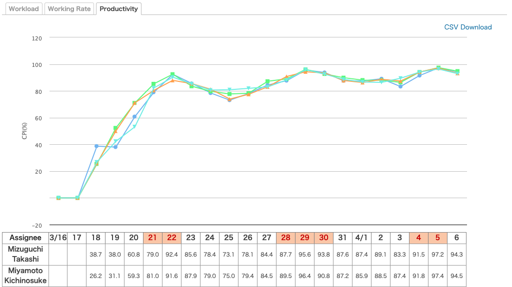
| Element | Description |
|---|---|
| Table | Displays productivity for each user. Productivity is calculated using the following formula. Sum total of (estimated times x progress) / Sum total of spent times |
| Graph | Average values for operation rate are displayed as line graphs. Clicking a user’s name will display a line graph for that user. |
コメント